Adding colour swatches to Shopify collection page
Shopify has proved to be one of the most intuitive and user friendly platforms if you wish to build an online business selling custom goods. With thousands of apps and integrations — and dedicated Shopify service providers, you are pretty much only limited by your imagination when starting your new business venture.
And with the new Shopify 2.0 theme engine and loads of new features, a LOT of desires can now be fulfilled much easier than ever before. Colour swatches on your collection pages is not a new thing, but it has often required that you found a theme that supported the feature or installed an app that could achieve same.
Today we will endeavour to build our own simple colour swatches section that will be displayed on a product card in a collection. Let’s start by clarifying the goal and challenges:
Our goal!
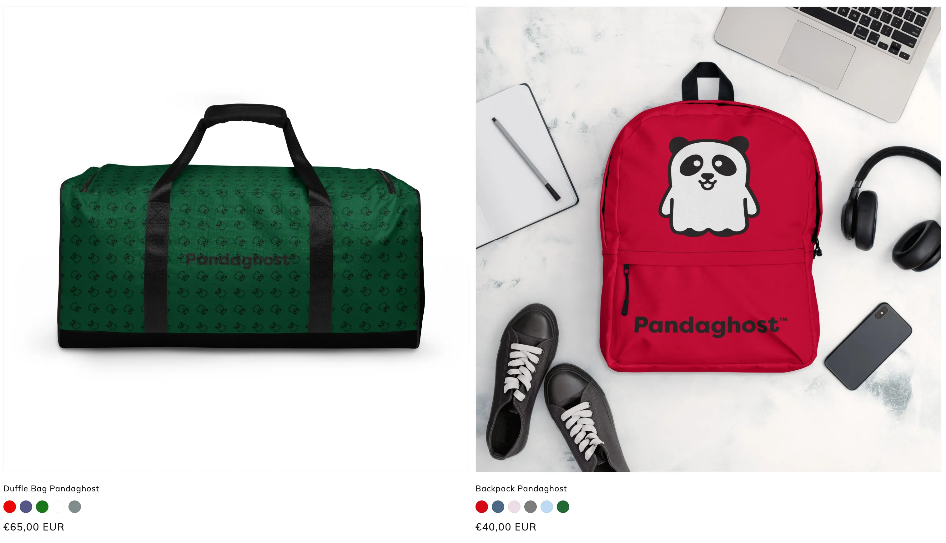
We want to create a simple list of colour swatches available for a given product. We are not interested in implementing additional functionality to the swatches at this point. All we care about is informing our visitors in an easy and simple way, that this particular product exists in “this array of colour options”. Once we enter the product details page, the theme will take care of the variant selection the way it already does, showing the image for the selected variant for better detail etc.
Challenge: The constraints
Existing apps or themes tend to require you to use a certain naming convention for the variant option such as “Color” in order to function. The script will then loop through variants using that key to render either an image with a reference using the colour property or a dot with an estimated background colour based on same.
One can quickly see how such constraint may feel limiting, especially if the website is not made for English speakers.
Challenge: Dealing with images
The way apps and themes use the image method is by converting the variant option name to lowercase characters, replacing spaces with underscores, and adding an image extension such as .jpg, .png, or .gif. This will then require the store manager to create relevant pictures with the same names, following a sizing standard and file format, and upload them to the assets directory in the theme codebase.
This can be intimidating for some, not to mention problematic should you have two different products with a Blue colour, but you want the nuance slightly different between the two products. Then you would have to come up with fancy naming conventions for your products in order to avoid naming conflicts and issues with existing image files.
NB: The benefit however for using images, is that you can represent patterns and textures that you wouldn’t be able to create simply using colours. We will get back to that.
Challenge: Dealing with colours
Should you choose NOT to go for the image standard, and allow the app or theme to automatically render swatches based on your variant colours, you may experience new limits and possibly misrepresentations of your colour. Say you have a shirt that comes in red and blue. You would be inclined to simply call them red and blue. But the red is like a Crimson Red and the blue is more of a Cornflower Blue — so you will realise, that if you don’t use colour names from the official CSS colour table, you will have displayed a different nuance or tint of the colour compared to what it really is.
Let’s get started
The best way to create a list of colour swatches, where we have complete control of the hex values and easily can work with them on the product page in Shopify admin, will be to use Shopify metafields!
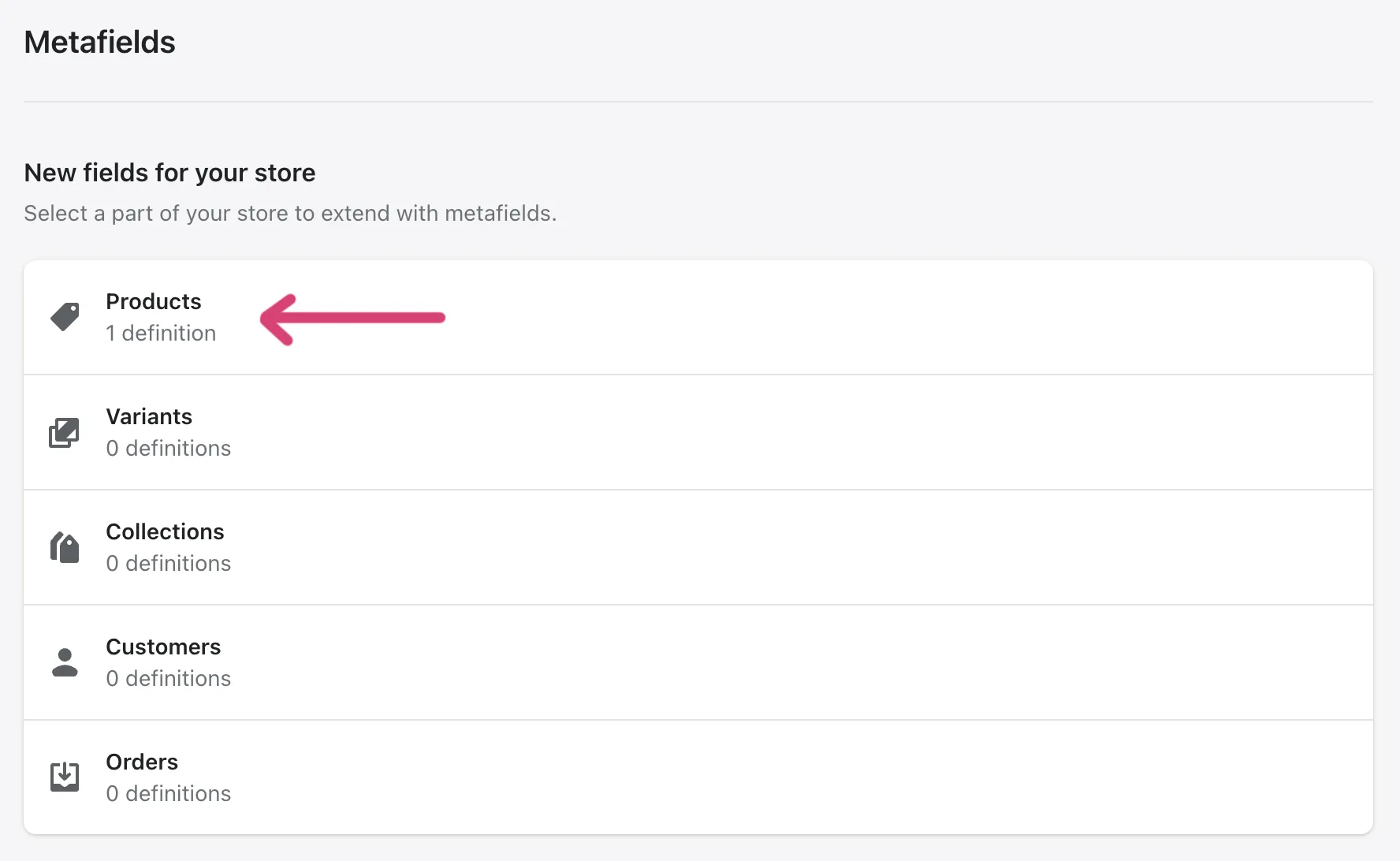
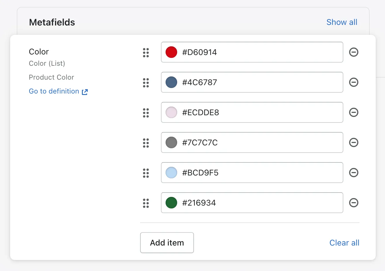
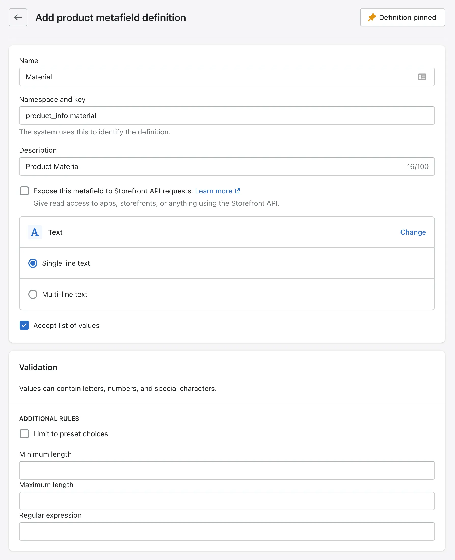
In Shopify, you can find metafields under Settings in your admin panel. The URL would be something like: https://your-store-name.myshopify.com/admin/metafields. We want to assign this metafield to a product, so we click on Products and then next on Add a definition.
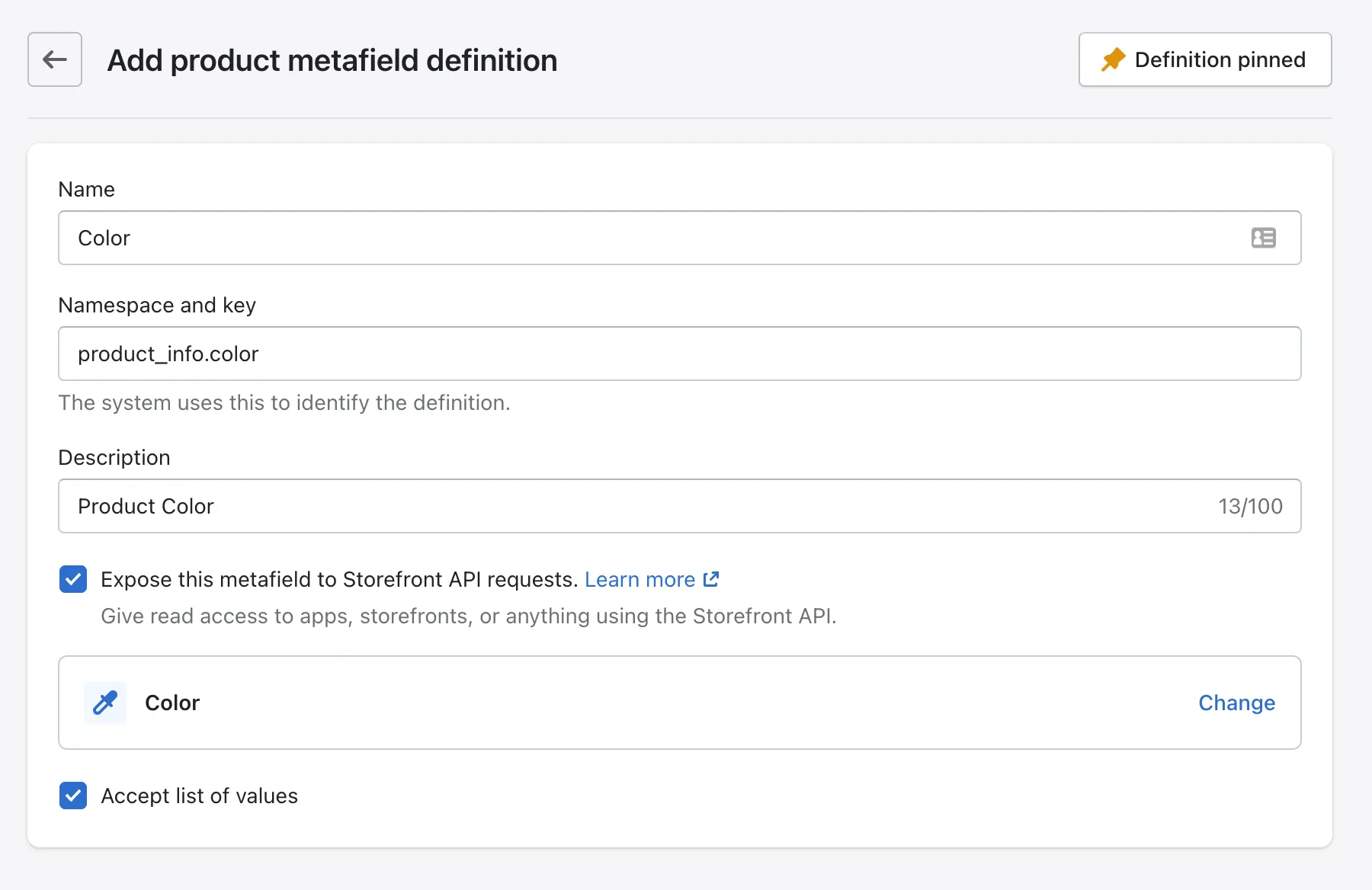
Creating a new metafield is straight forward. The only thing we want to ensure we do correctly while creating the metafield is to set the namespace and key to product_info.color, select Color as content type and making sure we check “Accept list of values”.
Note that you can’t change these values once saved.
Feel free to give the metafield a name of your liking and description as well.
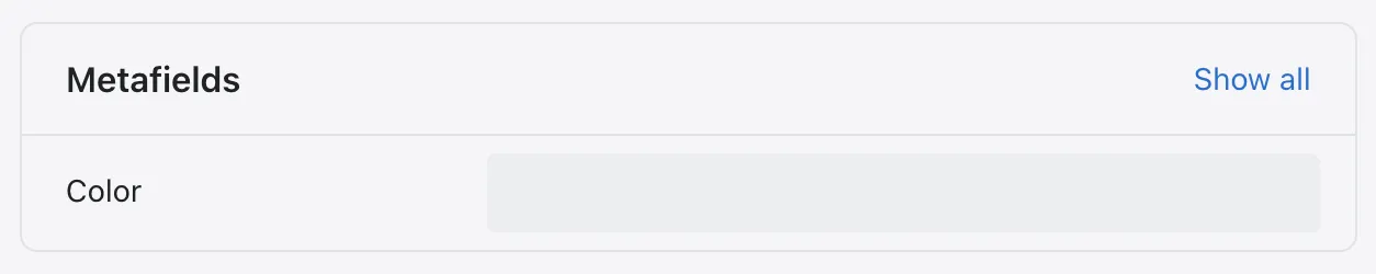
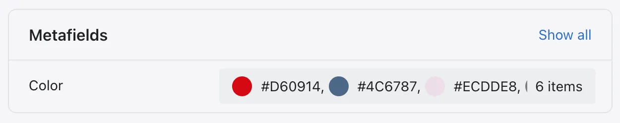
Now — if we go to a product in Shopify admin, we can find our metafield in the very bottom.
Let’s proceed by adding the colours that we wish to display for our product on the collection pages.
I am not kidding when I say that this was the hard part. At this point, you will just have to copy a few snippets I will include for you here, and you should be good to go. I will make sure to explain how it all works as well so you are aware of what you are adding and how it works.
So — this is the point where we have to play around in the codebase. This may seem intimidating to many, if you have no experience with code, but one beautiful thing about Shopify’s theming engine and the liquid language, is that it is a templating language, meaning that you don’t rely on lots of functions and event calling, but simply render data. And if you do anything wrong, you simply revert your changes and everything will work as before.
Full disclaimer: I am working in the default Dawn theme so the files I am changing will be referring to those of the Dawn theme. If you are working in a different theme, make sure to add these code changes to the equivalent snippets and sections in your theme files.
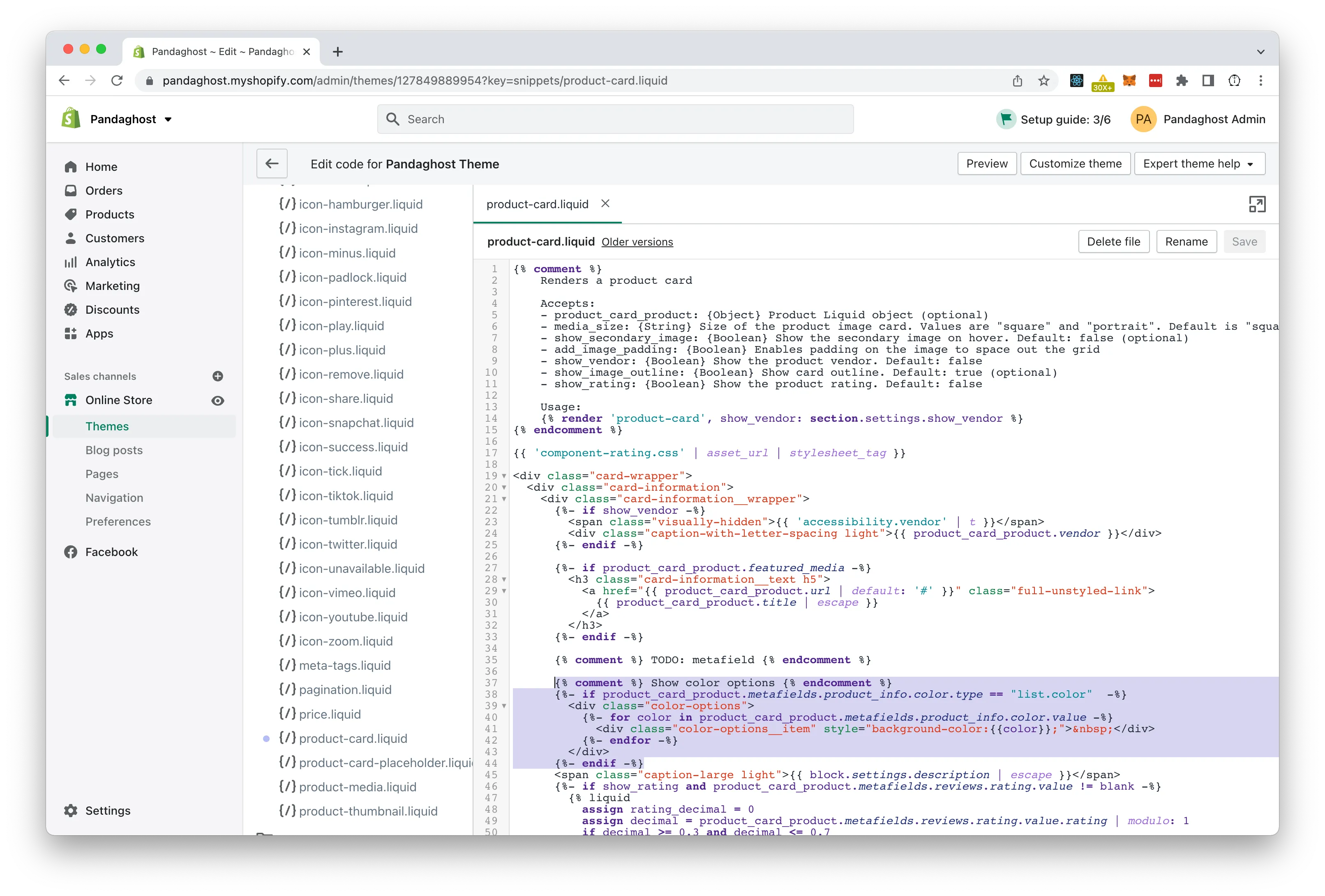
Let’s open the theme code editor in Shopify admin and locate the file for our product card. (In the Dawn theme it is called product-card.liquid and is located in the Snippets directory). Here we will add below code snippet so it appears under the product title.
{% comment %} Show color options {% endcomment %}
{%- if product_card_product.metafields.product_info.color.type == "list.color" -%}
<div class="color-options">
{%- for color in product_card_product.metafields.product_info.color.value -%}
<div class="color-options__item" style="background-color:{{color}};"> </div>
{%- endfor -%}
</div>
{%- endif -%}Basically what is happening here is that we start by checking if any colours actually have been added to the metafield. And if so, we create a wrapper we call “color-options”. In here we loop through the values of this list of colours, and display a “color-options__item” with a background-color set to each color.
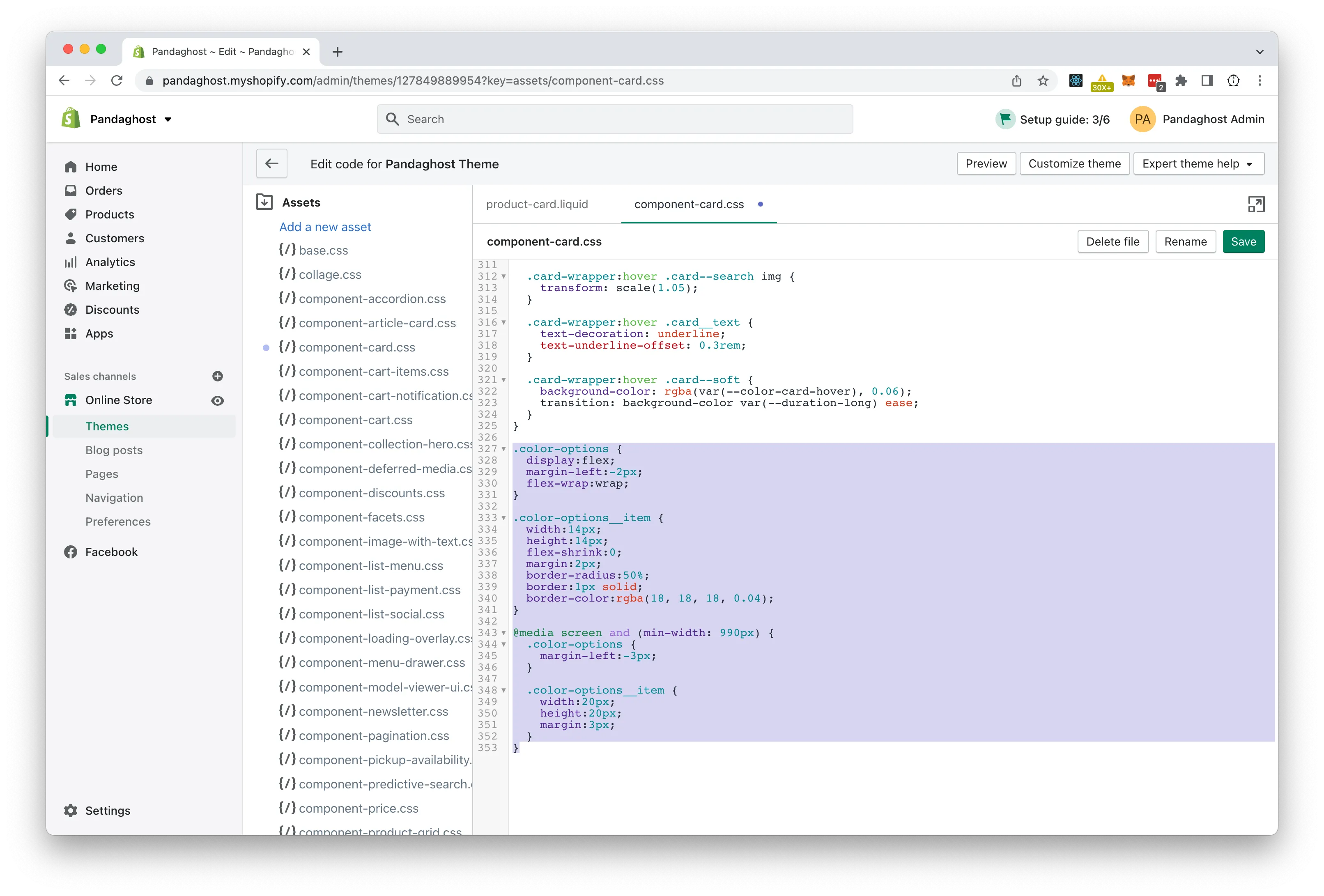
And then we want to update the css stylesheet for the product card to make our colour swatch look nice. In the Dawn theme, this is under the Assets directory and called component-card.css.
.color-options {
  display: flex;
  margin-left: -2px;
  flex-wrap: wrap;
}

.color-options__item {
  width: 14px;
  height: 14px;
  flex-shrink: 0;
  margin: 2px;
  border-radius: 50%;
  border: 1px solid;
  border-color: rgba(18, 18, 18, 0.04);
}

@media screen and (min-width: 990px) {
  .color-options {
    margin-left: -3px;
  }

  .color-options__item {
    width: 20px;
    height: 20px;
    margin: 3px;
  }
}
We add display:flex to our wrapper, to make sure the colours are listed nicely next to each other. we allow them to wrap so they don’t overlap on smaller screens, and then we add an initial negative margin, to compensate for the margins added to the swatch items.
The swatch items have a fixed size of 14px x 14px. We disable flex-shrink so they preserve their size and shape, add some margin so they are nicely spaced out, make them circular by setting border-radius to 50%, and then we add a solid border with an alpha value, which works as a frame around a white colour, but also adds a little bit of shadow to the other colours.
Finally we make sure to increase the size and spacing a little on bigger screens using a media query set to screens wider than 990px.
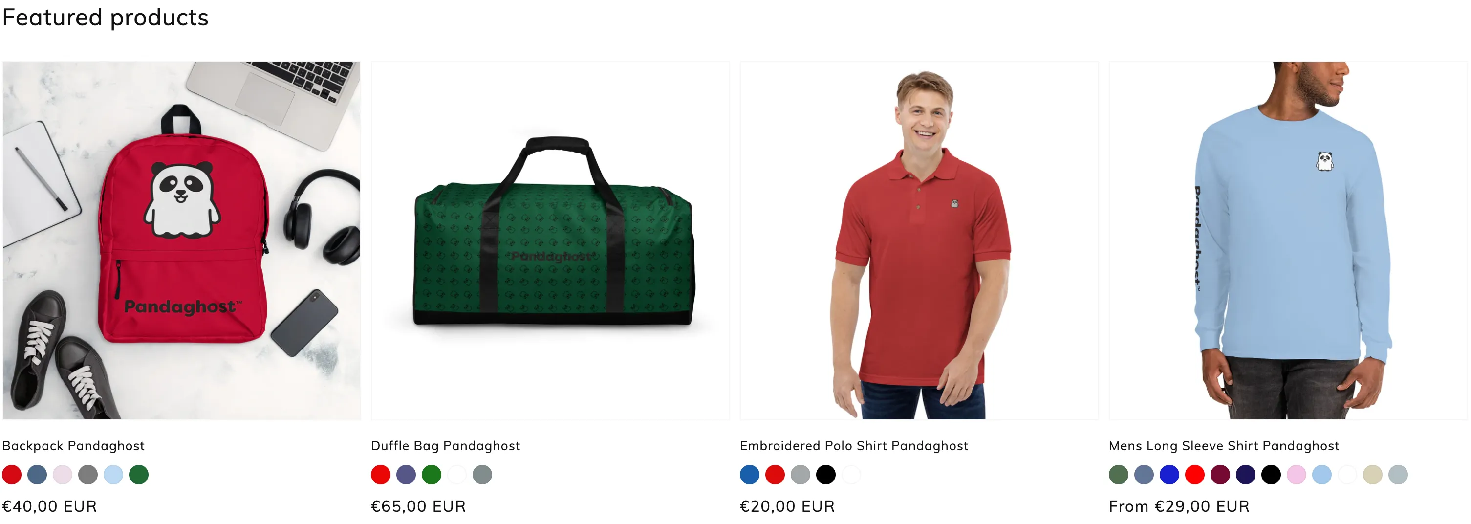
And that’s it! Now you should see a beautiful line of coloured dots that perfectly represents the colours of your product variants.
What’s next?
At this point, we have achieved our goal of showing the various colours our product is available in — but what if we wanted to have the option to show patterns or textures?
We can pretty much use the same concept of metafields and tweak our liquid snippet a little. What we would do then is to create a metafield definition with a namespace and key called product_info.material for example. And then instead of Color as a content type, we will choose Text, single line, and make sure to accept list values again.
What we will do then, is add a text field with an image reference for each material and texture available. In Shopify admin, we can go to settings, and right underneath Metafields, we have a button called Files. Here we can upload small images (approx. 30px x 30px) in any format we desire: JPEG, PNG, or GIF. We then copy the link and add that to the list of materials for our product in the metafields section.
We can then duplicate the liquid code we added for colours and make a few tweaks. Firstly we have to make sure we are checking and looping through the correct metafield: product_info.material and then we want to make sure it is a list.single_line_text_field instead of list.color.
Then we want to change one thing about the color options, so instead of background-color:{{color}}; we want it to say background-image:url({{color}});.
To round it off, we add an extra property to the CSS for .color-options__item saying background-size: cover;.
.color-options__item {
  width: 14px;
  height: 14px;
  flex-shrink: 0;
  margin: 2px;
  border-radius: 50%;
  border: 1px solid;
  border-color: rgba(18, 18, 18, 0.04);
  /* We insert this line */
  background-size: cover;
}
This will make sure to always fill out the swatch shape with the material image so it stays consistent when changing screen size.
Happy coding! 🤓 🥃